Genre: US Intelligence Maps
Item set
Items
-
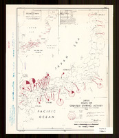 This colored map was produced by the OSS Research and Analysis Branch on September 1, 1945, and measures 42 × 31 cm. It vividly depicts Japan’s four main islands with carefully rendered geographic outlines, overlaid with circular pie charts that indicate shipping capacity at various ports. The map summarizes Japan’s 1934 port capacity by focusing on the gross shipping tonnage handled at key ports. It emphasizes a dramatic concentration of shipping activity along the western half of the Inland Sea, highlighting ports such as Moji, Kobe, Osaka, Shimonoseki, and Yokohama. Notably, the map omits any reference to Japan’s colonial empire—a significant exclusion considering the era’s aggressive imperial expansion and growing militarism. The pie charts, based on the British Moorsom system, offer insights into the maritime capabilities of these ports, reflecting the robustness of Japan’s shipping industry. Produced as Japan was transitioning from imperial ambitions to occupation, the map represents an critical moment in maritime history and remains a valuable document for understanding both Japan’s domestic infrastructure and its broader geopolitical context.
 -
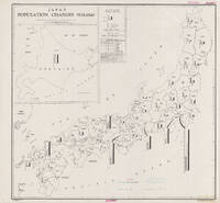 This thematic map describes population change across Japan from 1935 to 1940 in terms of natural increase, migratory change, and net change. It depicts Japan’s provinces with total population numbers and column graphs describing the population change for each province. Each column graph has three columns. The columns are differentiated by their patterns (stripes, dots, and solid color). The graphs are plotted on a scale that is measured by thousands of people. The reliability of the data that the map is based on is considered reliable and complete. This map argues that there is a movement of civilians from rural to urban areas. Given the broader context of WW2, the map also suggests that the Japanese population is industrializing. As a result of this industrialization, there were likely more jobs in urban areas which encouraged civilian migration. The significance of the map as it was created in 1944 is that the visual display of population density (particularly in urban areas) could have been used for military firebombing strategy during WW2. Important context for the map is that it was created in 1944 but displays data between 1935 and 1940. In addition, The Office of Strategic Services released the map one year before the United States dropped lethal aerial bombs on Hiroshima and Nagasaki. By 1943, the US military was exploring the combustibility of Japanese cities, and by 1944, the United States was fully engaged in the bombing of residential areas rather than the precision bombing that had characterized earlier war years.